- The genre that I was going for was horror/thriller/mystery and the shot I used was a medium close up of the shadow of a teenage girl. I have taken this shot at an angle which makes it seem as if the shadow is coming towards you or someone near you. In this picture you cant really tell if it's a male or female which is good because it adds to the mystery genre as you can't tell what kinda of person it is. This shot represents my genre in many ways, one is the darkness. The darkness creates a sense of thrill or mystery, and the picture clearly shows the shadow of someone. Also the fact that the person is holding a knife in the picture would make the audience feel quite scared.
- First of all I created the darkness, shadowy effect in one room. I made the room dark by closing the curtains and door, then I got a torch for my lighting. With my lighting I shined the torch onto the wall from behind the person. I positioned the person in front of a blank wall so that my picture would come out clearly, I also made the person hold the knife in a stabbing motion and turn her head so that we could see the side of her face. When I had finally got the position of the lighting correct I went round to the other side and took the picture so that it looked like the shadow was coming towards the viewer. I chose to do a medium close up because with the shadow effect I thought it would look more effective with just the face. I think that my picture turned out how i wanted it to.
Shreyaa's Induction Blog
Wednesday, 29 September 2010
Film genre Picture
Sunday, 26 September 2010
Wednesday, 22 September 2010
Camera Rules
Evaluation: Film Poster
For our film poster we chose to do a kid's superhero movie. Our poster is a picture of a small child that looked like he was flying in the air, in a superman outfit. Our movie for was called Super-junior, we had the little superman in the middle flying through clouds. In the poster he is smiling and has his arms outstretched as if he is really flying. We thought that this would make our poster more realistic.
We created this poster by using Photoshop, we have only briefly used Photoshop before so we weren't that confident with using it to create a poster. Making the poster was extremely difficult at times, towards the end it became quite frustrating. In Photoshop we learnt how to make the whole image brighter and more defined, we used this technique in our poster. We had to cut out the young boy for the film poster, this meant we had to refine the picture more to make it look as if it hadn't been cut out. To cut him out we used the lasso tool, we drew around him as close as possible and then we neatened it up. We did this by erasing the bits we didn't need, then we also had to colour in small parts that we needed. This was quite hard as we had to use a special tool to match the colour we needed, this took long to do. We also learnt how to use layers, so that the picture works well, this didn't take that long as it wasn't that hard. I'm really pleased with the main picture of the young boy, it came out better than I expected it would.
I think that next time we should practise using Photoshop a bit more, because then it will be easier to use and understand, although we did a good job this time next time it could be a bit better.
Sunday, 12 September 2010
Enemy of the State: Questions
1. The tension is being created by showing short clips of two men with weapons and then jumping back to the shot with Will Smith and Gene Hackman. This is because it makes the audience feel as if the two men are coming after them, as we only see short clips of them and then it's back to Will Smith. The music in this scene also creates a sense that something is about to happen. The point of this sequence is to make the audience aware of how fast technology is being changed and improved so quickly without us knowing exactly how powerful it is.

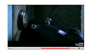
2. Here this close up is used to add to the thrill of this sequence, because this is showing one of the two men pick a lock. This may make the audience think that they are trying to get to Will Smith and that they are close to where he is.
3. I chose 1:30-1:45, the close up's here create a sense of curiosity within the sequence. Will Smith himself is wondering what is going on and how it could be happening. This also shows something is building up in this sequence, because there are so many close up's moving quickly from Will Smith to Gene Hackman, the audience feels like something suddenly is going to happen.
4. It fits in because it is fast paced and it jumps from one shot to another extremely quickly, which builds up the tension throughout, the audience are constantly wondering what is going to happen. We don't see the end of the sequence but in the end we can predict that there will be some sort of action/thriller scene with the two unknown men and Will Smith.
Interesting Photo

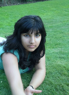
This is a slightly high angle, close up shot of a teenage Asian girl. I took this photo on a slightly hilly area, this is so I could get a high angle on the picture. I think that the high angle shows that could be a victim,as we are looking down on her. In this photo she is wearing casual clothes, which can suggest that she is in a place of comfort. She isn't wearing any make up, this could tell us that she is either not a confident person, or that she is confident in her natural self. Her facial expression is like a blank canvas, so we can't say exactly what kind or person she could be. We could say that she is a mystery to us, also you can see that her right side of her face is light whereas the left side is quite dark. This suggests that she has two different sides to herself. Overall, I think that the photo creates a sense of mystery in the character, it keeps us guessing about who she could be and who she really is.
Subscribe to:
Comments (Atom)
